
Control your house in Home Assistant with a Picture Elements Card
What is a Pictures Elements Card?
A Picture Elements Card in Home Assistant is a highly customizable interface component used in the dashboard to represent various smart home devices and sensors visually. This type of card allows users to overlay interactive elements such as icons, states, and buttons on top of a chosen background image.
The background can be any image that represents the user’s home layout or any other relevant visual context. The interactive elements are positioned absolutely over the image, and they can represent different entities in the Home Assistant ecosystem, like lights, thermostats, or security cameras.
When these elements are clicked or tapped, they can display real-time information or provide control actions, like turning off a light or adjusting the thermostat
This is an example from the Home Assistant demo page:

Types of Elements
As the official documentation states:
Elements are the active components (icons, badges, buttons, text, etc.) that overlay the image.
There are several different element types that can be added to a Picture Elements card
- State badge: this element creates a badge representing the state of an entity.
- State Icon: This element represents an entity state using an icon.
- State Label: This element represents an entity’s state via text.

- Service Call Button: This entity creates a button (with arbitrary text) that can be used to call a service.

- Icon: This element creates a static icon that is not linked to the state of an entity.
- Image: This creates an image element that overlays the background image.
- Conditional: Much like the Conditional card, this element will let you show its sub-elements based on entity states. (Example on the right showing or not the away icon depending on its state)

- Custom: The process for creating and referencing custom elements is the same as for custom cards. Please see the developer documentation for more information.
Creating the Pictures Element Card in Home Assistant
Base image
Start by designing a floor plan of your home using one of the many tools you can find online (a quick Google search for ‘floor plan creator’ should yield plenty of options). Once your floor plan is ready, upload the file to Home Assistant following the instructions here so it can be used in the Pictures Element Card.
It’s important to note that Home Assistant doesn’t offer the option to adjust the size of the card that displays your image. Therefore, to ensure your floor plan image fully utilizes the available space in the Picture Elements Card, I recommend cropping out any unnecessary blank spaces surrounding the actual floor plan.
The image displayed below will be used as an example for this guide:

Add a new Card to your Home Assistant Dashboard
In Home Assistant, go to Overview (left panel) -> “Edit Dashboard” (three dots on the top right) -> ADD CARD (bottom of the page)
Search for Picture Elements and select it. You’ll see an image like this:

By default Home Assistant will show you a “default” floor map with a state-badge icon showing any of the sensors found in your installation. Now it’s time to personalise the Card with our floor plan and items.
Replace the base image with your floor plan
By following the instructions to upload your floor plan into Home Assistant, you’ll obtain a URL for the image that typically looks like this:
http(s)://[HOME_ASSISTANT_IP_OR_URL]:[PORT]/local/[FILE_NAME]In this guide, we’ll use a URL formatted as follows (note that Home Assistant in this instance is accessible only within the internal network and requires VPN access):
http://192.168.1.10:8080/local/coloured-floor-plan.png
Adding items to the Pictures Elements Card
Make a list of the elements you want to see on the Card for each room. In this guide, we’re going to add the following elements per room:
- Bedroom (top left): one smart light and one motion sensor
- Bathroom: one water leak sensor
- Hallway: two motion sensors and one smart switch
- Kitchen and Living Room: the kitchen will be equipped with smart LED lights, while the living room will feature a smart light and a camera.
- Entry: one door sensor
- Outdoors: an away icon will be displayed when the house in unoccupied
Bedroom (top left)
The items to be displayed in this bedroom include a smart light and a presence sensor. We aim to display an icon for each device on the floor plan, reflecting their status. Additionally, clicking on these icons should provide more information and, for the smart light, enable control options like turning it on or off, changing color, intensity, etc.
For the interactions described above, the ‘state-icon‘ element type is the most suitable.
To set up a state-icon for each device, we need their entity IDs. These can be found under ‘Settings -> Devices & Services -> Entities‘. Simply search for the entity name there.
The entity IDs we will use in this example are:
- light.bedroom
- binary_sensor.bedroom_presence_sensor_occupancy
With these entity IDs, we can proceed to configure the state-icons. The code to be added to the Picture Elements Card is:
  - type: state-icon
    title: Presence sensor bedroom
    entity: binary_sensor.bedroom_presence_sensor_occupancy
    style:
      top: 11%
      left: 11%
  - type: state-icon
    title: Bedroom
    entity: light.bedroom
    style:
      top: 32%
      left: 11%
This code should be placed in the ‘elements’ section of the Picture Elements Card. The ‘top’ and ‘left’ values under ‘style’ represent the CSS coordinates for positioning the icon. Adjust these values as needed to position the icon at the desired location on the floor plan.
Below is an image showing the Picture Elements Card with the state-icons configured for the top left bedroom.

Bathroom
To display the status of a water leak sensor in the bathroom, we will use a state-badge. The entity ID for this sensor is ‘binary_sensor.water_leak_sensor_water_leak‘. The following code should be added to the Card:
  - type: state-badge
    entity: binary_sensor.water_leak_sensor_water_leak
    title: null
    style:
      top: 28%
      left: 35%
      '--ha-label-badge-title-font-size': 0em
      transform: 'scale(0.5, 0.5)'
In the style section, two important modifications are included:
- ‘–ha-label-badge-title-font-size’: 0em – this setting removes the text label under the icon.
- transform: ‘scale(0.5, 0.5)’ – this adjustment reduces the size of the icon, ensuring it fits properly within the bathroom area on the floorplan.
Below is an image of the floor plan that includes the state-badge for the water leak sensor located in the bathroom.

Hallway
The hallway is configured with three different items: two motion sensors (positioned at each end) and a smart switch for controlling the lights. The corresponding entity IDs for these elements are:
- binary_sensor.hall_end_sensor_occupancy
- binary_sensor.hall_entry_motion_sensor_occupancy
- light.hall
The following code should be added to the Card:
  - type: state-icon
    title: Motion sensor 1
    entity: binary_sensor.hall_end_sensor_occupancy
    style:
      top: 35%
      left: 25%
  - type: state-icon
    title: Motion sensor 2
    entity: binary_sensor.hall_entry_motion_sensor_occupancy
    style:
      top: 56%
      left: 41%
  - type: state-icon
    title: Hall lights
    entity: switch.hall
    style:
      top: 55%
      left: 25%
With this setup, the floorplan now displays icons for the two motion sensors and the light switch in the Hallway:

Kitchen and Living Room
This floorplan features a modern and spacious open-plan kitchen combined with a living room. We plan to include an icon to manage the kitchen’s LED lights, another to operate a smart light in the living room, and a third to control a camera also located in the living room.
The entity IDs to use are:
- light.kitchen_leds
- light.living_room
- camera.tapo_camera_c210_living_room_hd
We will use state-icons to represent the lights and a standard icon for the camera. The code to be added to the Card is as follows:
  - type: state-icon
    title: Kitchen LEDs
    entity: light.kitchen_leds
    style:
      top: 24%
      left: 60%
  - type: state-icon
    title: Living room
    entity: light.living_room
    style:
      top: 60%
      left: 60%
  - type: icon
    icon: mdi:video
    entity: camera.tapo_camera_c210_living_room_hd
    style:
      top: 53%
      left: 50%
    hold_action:
      action: call-service
      confirmation: true
      service: script.tapo_camera_c210_privacy_mode_off
      data: {}
Note the camera icon includes a hold_action. This action is triggered by pressing and holding the icon. It deactivates the camera’s privacy mode, initiating recording and live streaming.
With these additions, the floorplan now displays icons for the smart lights in the kitchen and living room, as well as for the camera.

Entry and Away icon
In this example floorplan, we will display a door sensor at the entry door. Additionally, an icon representing a person outside the house will indicate the ‘away’ state.
The ‘away’ state is an input boolean (helper) in Home Assistant. It is set to ‘on’ when the represented person is not at home, and ‘off’ when they are home.
The entities to be used are:
- binary_sensor.door_sensor_1_contact
- input_boolean.away
The ‘away’ icon will only be displayed when its state is ‘on’. To implement this, we will use a conditional type in the code.
The code to be added to the card is as follows:
- type: state-icon
title: Door sensor 1
entity: binary_sensor.door_sensor_1_contact
style:
top: 75%
left: 36%
- type: conditional
conditions:
- entity: input_boolean.away
state: 'on'
elements:
- type: state-icon
title: Away
entity: input_boolean.away
style:
top: 96%
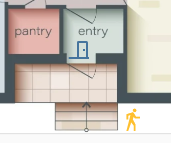
left: 47%The image below shows the floorplan displaying the icon for the door sensor and the ‘away’ state icon, which is currently active.
Final result
This is the resulting floorplan with all the elements discussed in this guide:

As we’ve seen in our guide, configuring this card is straightforward, especially when you have the entity IDs handy. The simplicity of adding new elements to the card by editing it directly means that your dashboard can evolve as your smart home grows.
Moreover, the ability to personalize the CSS allows for even greater customization. For those looking to customise further the dashboard’s look and feel, the Home Assistant Community forums are a good source of CSS customizations and creative ideas shared by other users.